Spectacular, an online platform for architects and designers, sought to boost user engagement by creating a mobile app. This case study details the design process, methods, and outcomes of the Spectacular app.
Company
Spectacular
Role
Lead Product Designer
Duration
Nov 2023 - Feb 2024
PLATFORM
Mobile App
Introduction
Spectacular underwent a redesign to better user experience and engagement on its web platform. Despite improvements, users expressed a strong need for a mobile app to access the platform conveniently from anywhere. This case study outlines the design process and outcomes of creating the Spectacular mobile app.
Solution
Animated Prototype. Homepage flow
Problem
Users of Spectacular, primarily architects and designers, found it challenging to access the platform on-the-go, leading to decreased engagement and convenience.
IMPORTANCE OF SOLVING THE PROBLEM
Enhancing mobile accessibility would significantly improve user engagement, satisfaction, and convenience, aligning with modern usage trends.
Design Goal
Develop a mobile app for on-the-go access.
Enhance user engagement and interaction.
Simplify user experience on mobile devices.
Ensure consistency with the redesigned web platform.
UX/UI Requirements
Intuitive navigation and clean interface.
Core functionalities: project posting, image sharing, social updates.
Consistent branding with the web platform.
Optimized for performance on iOS and Android devices.
Research and Discovery
Agile Development: Iterative design and development process.
User-Centered Design: Focus on user needs and feedback.
User Research Methods
Survey: Quantitative data from a broad user base.
User Interviews: Qualitative insights from targeted users.
Personas: Representative archetypes of key user segments.
User Empathy Map: Understanding user emotions and experiences.
User Journey Story: Visualizing user interactions with the platform.
Agile Methodology: Four sprints
SURVEY: 30 PARTICIPANTS
Understand the extent of frustration among users regarding the lack of mobile access to Spectacular.
Determine the specific functionalities and features related to project sharing that users find most valuable.
Assess the importance of image sharing for receiving feedback and its impact on user engagement.
Gauge the demand for social updates among users and identify preferred content types.
SURVEY TAKEAWAYS
85% of students and 70% of professionals expressed frustration with the lack of mobile access.
90% valued the ability to share projects on-the-go.
80% highlighted the importance of image sharing for feedback.
75% desired social updates to stay informed about industry trends.
Interview stats data
USER INTERVIEWS: VIDEO CALL. 10 PARTICIPANTS
Explore how users define “quick access” and what features would facilitate faster interaction with Spectacular.
Understand how professionals currently utilize their commute time and how a mobile app could enhance their productivity.
Investigate the specific networking needs and preferences of younger architects within the industry.
USER INTERVIEWS TAKEAWAYS
Users needed quick access for inspiration and updates.
Professionals wanted to utilize commute time effectively.
Networking opportunities were a key aspect for younger architects.
Interview stats data
User Analysis
User stories
As a design student, I want to create a project and join a Studio Award competition, so I can showcase my work, get community feedback, and gain recognition from a renowned jury.
As an architect, I want to check updates on Spectacular while commuting, so I stay informed about new trends and projects.
As a young architect, I want to share images from the AIA conference, so I can showcase my experience and insights with my network on Spectacular.
User Journey Story
USER JOURNEY TAKEAWAYS
Opportunities:
Improve app performance to reduce loading times.
Enhance the search functionality for more intuitive and helpful results.
Streamline navigation to make accessing the profile section easier.
Continue gathering user feedback to identify and address pain points.
Pain Points:
Slow Loading: Frustrating initial load times.
Cluttered Search: Overwhelming search results.
Complex Navigation: Difficult access to certain sections.
Network Issues: Poor performance with weak connections.
User Experience:
Positive: Easy project saving and notification checking.
Negative: Frustration with slow load times, cluttered search, and complex navigation.
Actions:
Design search with clear filters and better suggestions.
Create an intuitive navigation bar.
Use in-app surveys and testing for continuous improvement.
Design Outcome
Inclusion of Universal Search bar.
Featured content at the top.
Fixed search bar upon scrolling.
Networking Suggestions on Homepage: Carousel with user details.
Search Bar Improvements: Simplified process, clearer filters.
Sketch version 1. Transition from Home screen to search/post bar.
User Testing
PAPER PROTOTYPE INTERVIEW
Conducted video call interviews with 8 participants.
Interview Statistics
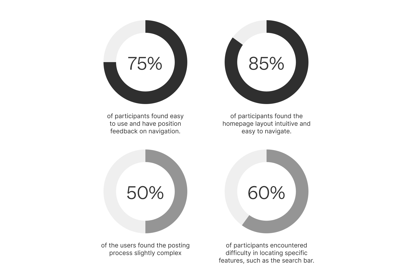
WHAT WENT RIGHT
Positive feedback on navigation and ease of use from 75% of participants.
85% of participants found the homepage layout intuitive and easy to navigate.
WHAT WENT WRONG
Users found the posting process slightly complex, with 50% expressing confusion.
60% of participants encountered difficulty in locating specific features, such as the search bar.
DESIGN ACTIONS TO TAKE
Simplified the posting process and enhanced the search functionality.
ITERATION AFTER THE USER INTERVIEW
Iteration of the Post functionality
Iteration of the Search functionality
Brand Elements
SPECTACULAR BRANDING
Hi-Fi Prototype
MAIN FLOW
Post flow
Animated Prototype. Post flow
Search flow
Animated Prototype. Search flow
App screens
Home Screen Iteration
ADDRESSING CEO FEEDBACK:
The current “Post” icon (and it the selection variant mode), could be misinterpreted as the “Edit” icon. To improve clarity, we recommend revising the design of the “Post” icon.
To enhance user experience, we propose replacing the “hamburger icon” used for filtering functionality with a more intuitive and recognizable symbol.
Post iteration after CEO evaluation
Next Steps
Integrate New Features: Based on user feedback, such News and in a second face, Direct Messaging.
Ability to create Groups.
Ability to easily share the user Profile with other Apps and platforms.
Outcomes
Increased Engagement: 40% increase in user engagement within the first month.
Improved Experience: 90% of users reported a positive experience.
Consistency: Designs align with the web platform for a seamless experience.
User Satisfaction: 95% user satisfaction with the app’s convenience and functionality.
WHAT I LEARNED
Effective mobile design significantly boosts user engagement, and continuous testing and iteration are essential for maintaining usability and satisfaction. User feedback is crucial in iterative design, as it provides insights that guide improvements.


.png)


.png)
