UX Design
UI Design

Black Spectacles Dashboard Redesign

Black Spectacles Dashboard Redesign

overview

Enhancing the Study Experience for Architects Preparing for the ARE 5.0 Exams. The Black Spectacles dashboard redesign aimed to create a structured, intuitive experience for ARE 5.0 exam prep.

Company

Black Spectacles

Role

Product Lead Designer

Duration

January 2024 - April 2024

PLATFORM

Desktop Product

Introduction

Black Spectacles began by offering software learning resources to help professionals stay updated with industry trends. Today, they support young architects through ARE test prep, an ARE community, and Spectacular Design, providing resources and a community to guide them to licensure. Their mission is to support early-career architects in building their futures with effective study materials and expert advice. We responded to user feedback by replacing confusing PDF guides with a daily web-guided study path, enhancing navigation, content accessibility, and overall user satisfaction.

Solution Screen

Problem Statement

Students reported feeling stuck and lost when studying with the current PDF study guide. The static nature of the PDF format made it easy to misplace and hard to follow a structured study plan.

IMPORTANCE OF SOLVING THE PROBLEM:

For Users: Provides a clear, structured study plan that reduces confusion and enhances learning efficiency. For Business: Improves user satisfaction and retention, increases recommendations, and strengthens Black Spectacles’ market position.

Design Goal

  • Increase User Retention: Achieve a 20% increase in user retention by providing a structured, interactive study plan.
  • Enhance User Engagement: Improve daily active usage by 30% through a day-by-day guided study dashboard.
  • Improve Pass Rates: Boost exam pass rates by 15% by offering a clear, manageable study path.
  • Streamline User Experience: Reduce reported user confusion by 50% through an intuitive, classroom-like dashboard.
Old Dashboard

UX/UI Requirements

  • Intuitive navigation and clean interface.
  • Daily structured study plans with specific tasks and content.
  • Progress tracking and notifications.
  • Consistent branding and optimized performance for web and mobile.

Research and Discovery

Agile Development: The project will be divided into three sprints, each one month long.

User-Centered Design: Focus on user needs and feedback.

User Research Methods

  • Survey: Gathered insights on user preferences and behavior.
  • User Interviews: Explored challenges and preferences.
  • Personas: Developed to represent different user types.
  • User Empathy Map: Identified user feelings, thoughts, and actions.
  • User Journey Story: Mapped out user interactions with Spectacular.
Agile Methodology: Four sprints

Product Research

HOLISTIC ANALYSIS OF THE CURRENT DASHBOARD DESIGN.

Navigation and Layout

Issues: The dashboard’s navigation and layout are not optimized for guiding students through a structured study plan. The elements are listed sequentially without a clear, cohesive flow that encourages daily engagement.

Study Flow and Structure

Issues: The current structure is segmented into different components (e.g., Video Lectures, Lecture Slides, Quizzes) without clear instructions on how to integrate these elements into a daily routine. This can overwhelm students and make it difficult to know where to start or what to do next.

Progress Tracking

The current progress tracking is limited and scattered across different sections. It does not provide an integrated view of the student’s overall progress.

User Engagement and Motivation

The dashboard lacks engaging elements that motivate students to return daily and stay on track with their studies. There is also minimal feedback or encouragement provided to users as they complete tasks

Visual Design and Usability

The visual design is functional but lacks a dynamic and engaging aesthetic. The overall color scheme and layout do not effectively highlight key areas or guide the user’s attention.

Current Dashboard interface

COMPETITOR ANALYSIS TAKEAWAYS:

Personalization and Customization

  • Competitors like Udemy and Coursera offer tailored course recommendations, enhancing user engagement.
  • Thinkful and T-Course use progress tracking, badges, and feedback tools to keep users motivated.
  • Clear, user-friendly navigation is a key strength across competitors, as seen in Thinkful and Skill Up.
  • A variety of content formats (videos, quizzes, reading materials) cater to different learning styles.
  • Interactive elements like quizzes and community forums enhance engagement, noted in Coursera and Skill Up.

Opportunities

  • Enhance personalization with adaptive learning paths.
  • Introduce more interactive and gamified elements.
  • Further streamline navigation for ease of use.

Pain Points

  • Overwhelming content options can be mitigated with guided paths.
  • Lack of immediate feedback in self-paced courses can impact learning.

Competitors Analysis

User Analysis

USER INTERVIEW GOALS:
  • Explore specific challenges faced during studying.  
  • Understand user preferences for study formats.
  • Identify key features that would improve the study experience.
  • Collect detailed feedback on current study habits.
  • Assess user satisfaction with current study tools.
USER INTERVIEW TAKEAWAYS (20 PARTICIPANTS):
  • 85% need quick access to study materials, emphasizing a centralized, easy-to-navigate dashboard.
  • 75% found the current navigation cumbersome, indicating a need for a more intuitive layout.
  • 90% prefer a guided study plan to stay organized and focused on daily topics.
  • 70% value real-time feedback and support, including live Q&A, forums, or instant messaging with instructors.
  • 80% want a streamlined, intuitive interface, minimizing clutter and clearly presenting essential study components.
User Interviews Results

User Personas

User stories

As a junior architect, Alex needs a structured daily study plan so that he can balance work and study effectively.

As an experienced architect, Maria wants a dashboard that adapts to her busy schedule and helps her prepare for the ARE 5.0 exams efficiently.

User Journey Story

USER JOURNEY TAKEAWAYS

Opportunities:

  • Personalized Study Plans: The ability to customize study plans based on the user’s schedule and needs was highly valued and can be further expanded with more personalized options.
  • Flexible Scheduling: Users appreciated the flexibility to adjust their study plans. There is an opportunity to enhance this feature by offering even more adaptable scheduling options, such as automatic rescheduling for missed tasks.
  • Engagement Features: While engagement features like daily streaks were motivating, there is room to innovate with more diverse motivational elements, such as personalized milestones or rewards for consistent progress.

Pain Points:

  • Pressure from Engagement Features: Some users, like Maria, felt pressured by maintaining daily streaks, which could lead to anxiety. It’s important to balance motivational features with flexibility to avoid adding unnecessary stress.
  • Busy Schedule Management: Users often struggle to keep up with their study plans during particularly busy periods. This highlights the need for more supportive features that help users manage their workload and stress levels.
USER FLOW

Brand elements

SPECTACULAR BRANDING
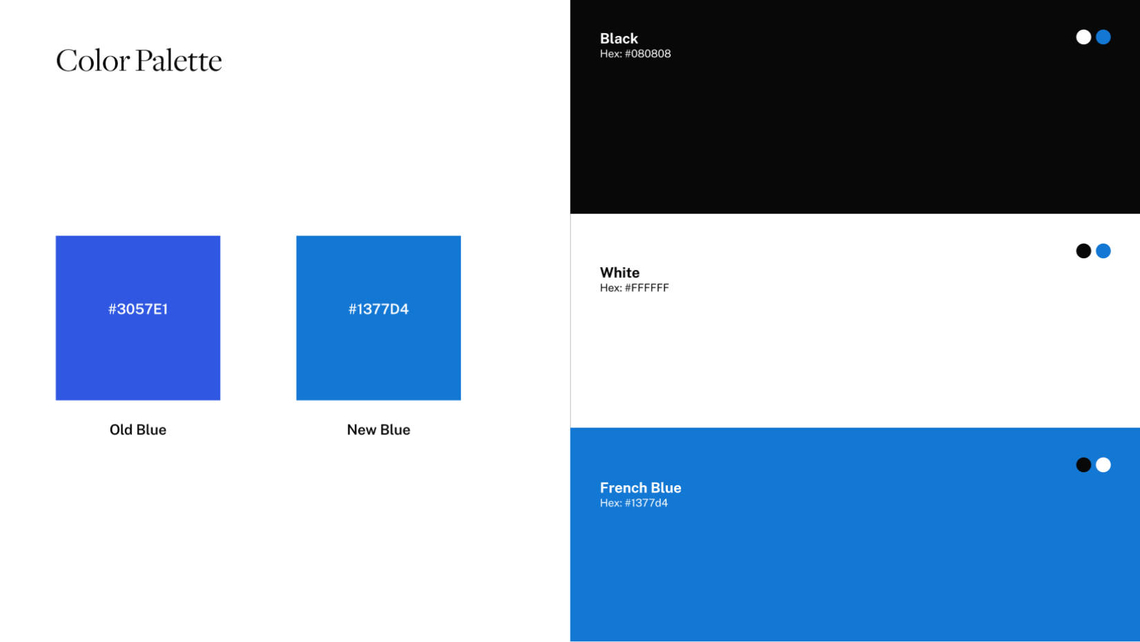
Color
Color Accessibility
Typography

Proposed Redesign

Daily Study Plan Integration: Create a dashboard that displays a clear daily study plan, integrating video lectures, quizzes, and other resources. This should be customizable based on the selected study duration (30 or 60 days).

Unified Progress Tracker: A single progress tracker that provides a comprehensive view of the student’s progress across all study modules, including videos, quizzes, flashcards, and practice exams.

Engagement Features: Implement features like daily streaks, achievements, and personalized feedback to keep students motivated and engaged throughout their study journey.

Improved Navigation and Layout: Redesign the layout to ensure a logical flow of study activities, with a prominent placement of daily tasks and an intuitive navigation structure that guides the user effortlessly through their study process.

Enhanced Visual Design: Update the dashboard’s visual design to be more modern and engaging, using a cohesive color scheme and design elements that draw attention to key areas and improve the overall user experience.

Wireframes

Sketch
Low-fi wireframe

Design Feedback

CEO TAKEWAYS:

Progress Tracking: The inclusion of a progress bar and percentage indicators for various study materials, such as video lectures and quizzes, is an excellent feature. It provides users with a quick overview of their progress and helps them stay motivated.

Engagement Features: The integration of engagement elements, such as the “Live Now” indicator for ARE Live sessions and the countdown timer for scheduled exams, is a great way to keep users engaged and on track with their studies.

IMPROVEMENT:

Call-to-Action (CTA) Visibility: While the design is clean, the CTAs, like “Download” and “See All,” could be more prominent. Enhancing their visibility with distinct colors or icons will make them stand out, ensuring users can quickly find and access key actions.

Hi-fi Prototype

Screens
Main flow

User Testing

PROTOTYPE INTERVIEW:

Prototype link: https://bit.ly/3WpqEV5

Conducted video call interviews with 7 participants.

For the user prototype interview, our goal was to gather comprehensive feedback on the usability, functionality, and overall user experience of the new dashboard.

WHAT WENT RIGHT :
  • Positive Feedback on Structure: Participants appreciated the structured daily study plan, finding it easier to follow and less overwhelming than the previous PDF guide.
  • Engagement Features Successful: The addition of achievements and daily streaks was well-received, with users feeling more motivated to return daily.
  • Improved Navigation: The redesigned navigation was highlighted as a significant improvement, making it easier for users to find and complete their tasks.
WHAT WENT WRONG:
  • Initial Confusion with New Layout: Some participants experienced a learning curve adapting to the new layout and features, suggesting a need for onboarding or introductory guidance.
  • Mobile Optimization Issues: A few users reported difficulties accessing certain features on mobile devices, indicating the need for further optimization for mobile use.
Interview Statistics

Next Steps:

Onboarding Guide: Develop an onboarding guide or tutorial to help users acclimate to the new layout and features.

Mobile Optimization: Enhance the mobile version of the dashboard to ensure all features are fully accessible and user-friendly.

Continuous Feedback Loop: Implement a mechanism for ongoing user feedback to continually refine and improve the dashboard.

WHAT I LEARNED

User-centered design is essential for effective digital learning. A day-by-day structure reduced overwhelm and improved efficiency, while engagement features like daily streaks and achievements boosted motivation.